Online marketing blog
Read about the latest industry trends and AdCumulus specials.
How to build a high converting landing page
By on 5. April 2017.

Scenario: You are an affiliate marketer advertising a product or a service. You’re launching cool, interesting and engaging ads which get you the precious clicks. What happens next? Where do we go from here? In the optimal plot, after the click comes the landing page.
Meet the landing page
By definition, it is an individual, visually engaging page, which contains a special offer which the user gets in exchange for giving away personal data like e-mail address. Its primary purpose is to turn product landing page visitors into leads and ultimately turn those leads into customers.
It is also the most underused conversion tool.
Landing pages are so common and accessible that it’s hard to believe not everyone has one. In fact, you can have as many landing pages as you want! But is simply having lead pages a guarantee for attracting page leads? Obviously not.
So, what is the secret to build high converting landing pages?
‘It’s not about the destination,…
…it’s about the journey’ is not just a quote used by people who finish last in marathons.
It’s completely true when it comes to landing pages, too. It’s about the customer’s journey from the click to the conversion, and the marketer’s journey from creating the landing page to pockets full of sunshine.
Aware of the gazillion articles out there about landing page optimization and creating great landing pages, we explored a different angle.
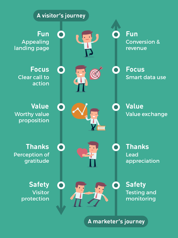
We looked at the logic behind building landing pages that convert, and saw the connection. Both the landing page visitor and the landing page owner go through the same stages of their ad-to-conversion journey, only in opposite directions.
Fasten your seat belts, ladies and gentleman, we’re about to take off.
The recipe for building a landing page that converts.
A visitor’s journey
FUN
This is the first station on the landing page visitor’s journey.
Your ad got his attention, promised value, and got you the click that catapults him to the landing page. You want to create a simple landing page that is visually appealing and eye-catching.
We’re not going to get too much into page design (you can browse the web for landing page best practices) but the recipe goes something like this.
Keep the imagery light, though, because you know what’s not cool?
Pages which load for ages.
Also, remember that more than half of your audience is browsing from their mobile phone, so optimize your landing page for smartphone viewing.
FOCUS
Unlike redirecting the visitor who clicked your ad to your home page, sending them to a landing page shifts all focus on the exact offer to avoid any distractions.
For extra safety, here’s a pro tip that’s so obvious you probably haven’t thought of it: one of the best ways to reduce distraction and increase landing page conversion is to simply remove the main navigation from the page.
And don’t have to limit yourself to one landing page!
Create more landing pages with different value proposals to generate more leads and be able to segment audiences.
VALUE
Baby, this is what you came for.
What’s a visitor going to do if he clicks an ad that promises winning a hundred dollars in cash and then lands on a Casino website’s homepage?
Leave, that’s what.
The importance of matching the headline of the landing page to its corresponding CTA cannot be stated enough.
Some of the most common examples of what visitors can get on landing pages are a free e-book, the possibility to sign up for a free product trial, an e-mail course or whatever else in exchange for their data commonly to be filled out into a short form.
Whatever it is, it must be valuable enough for them to give away personal data!
And remember – the more fields you ask your visitors to fill out in your form, the less chance you have of them completing your offer.
THANKS
Once you’ve successfully covered the “What’s in it for me?” part, the result of it should be to make your user feel grateful for what you are giving him, as crazy as this may sound.
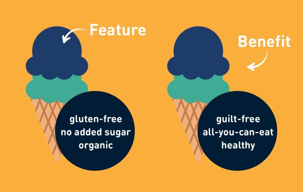
Nobody wants to hear about your products and solutions, but they are dying to hear about the benefits they could experience. Don’t get carried away and start listing the advanced features, because features are not benefits.
I repeat, features are not benefits.
Instead, always think about the user and how he or she will benefit.
Instead of saying “We have a powerful technology that enables the fastest loading video streaming service!” go with “Enjoy a streaming service that loads at lighting speed!” Not that difficult to tell them apart.
SAFETY
It seems visitors are a lot more likely to subscribe when there are safety signals – after all they are giving you their data.
People are now more resistant than ever to give up their personal information. Luckily, there are a few methods to approach this problem and encourage visitors to feel safe giving away their info:
• assure your user their email and other data won’t be shared or sold with a privacy message
• make sure you’re not talking to robots and protect sensitive information with security seals or captcha
• convince users of your product’s quality with testimonials and customer logos of satisfied product users.
A marketer’s journey
SAFETY
Your landing page is a waste of time and money if you click ends up crash-landing, so don’t forget to test, test, and test some more!
Then, once it is out, you’ll want to make sure your ad actually links to the right landing page.
Sounds harsh, but we live in the real world where ad fraud is very real and people pose transparent layers over ads in order to transport you to some shady landing pages and crush your reputation.
Luckily, technology has given us the alternative to checking things manually and created amazing things like the AdInvestigate, which shows you the whole advertising flow from the click to the landing page – for all ads running on the market.
Yep, this means you can even peek at what’s working for others for some inspiration.
THANKS
You’ve actually gotten that click on the ad, welcomed a visitor to your landing page, and got them to fill out the form / download the e-book / sign permission to give up their kidney.
Congratulations! You now have a full-fledged lead.
Be a nice person and give thanks by redirecting them to a separate thank-you-landing-page or by sending an automated thank-you-e-mail to the e-mail address you just collected. Just make sure not to overwhelm the lead and scare them away before you even get a chance to pitch a real offer to them.
Say thanks but keep it classy.
VALUE
The fundamental power of having a landing page is getting valuable information from the visitor by offering something valuable in return.
Assuming you’re offer is useful and irresistible, the goal is now to make it as easy as possible for visitors to convert, providing as little distance and as few barriers as possible between points A and B.
The next step should always be obvious.
This strategy varies depending on what your desired conversion is. If it’s form submission, make that form too beautiful to resist. If it’s downloads, create a button impossible not to click on.
FOCUS
Each time a visitor clicks on your PPC advertising or the URLs which appear in organic search results, the ultimate goal is to motivate them to take action that you expect.
So make sure your landing page is optimized to begin with. Once they convert – ding ding!
What was that?
The sound of valuable information about leads which you have acquired through the landing page.
Now, you know exactly who you are selling to and you can direct your focus your attention and efforts to them exactly.
Another idea is to segment leads and send different follow-up emails according to analytics insights.
In any case, tracking page performance will save you the extra mile down the road.
FUN
At the end of the road is where the fun starts happening for you, because you’ve:
• got a visitor to click on your ad
• redirected them to a proper landing page
• traded valuable product/service for valuable data
• used that data to reach out to leads and create the perfect offer for them
• converted a lead into a customer who puts dollars in your pockets.
The bottom line
If you haven’t been using landing pages to generate leads before, hopefully this article will motivate you to attempt this marketing strategy.
When you start this trip, remember to pack the essentials: FUN, FOCUS, VALUE, THANKS and SAFETY. Appealing landing page, clear call to action, worthy value proposition, perception of gratitude, and security promise will get your customer to the destination.
Testing and monitoring, lead appreciation, value exchange and smart data use will get you to the finish line.
Just make sure your customers enjoy the trip so much that they wish to come back.
Now that’s what I call safe landing!


Comments